Understanding my clients to help them emotionally connect with their audience begins with my own brand story . . .
Studio Cowx – more than just a name that’s impossible to pronounce!
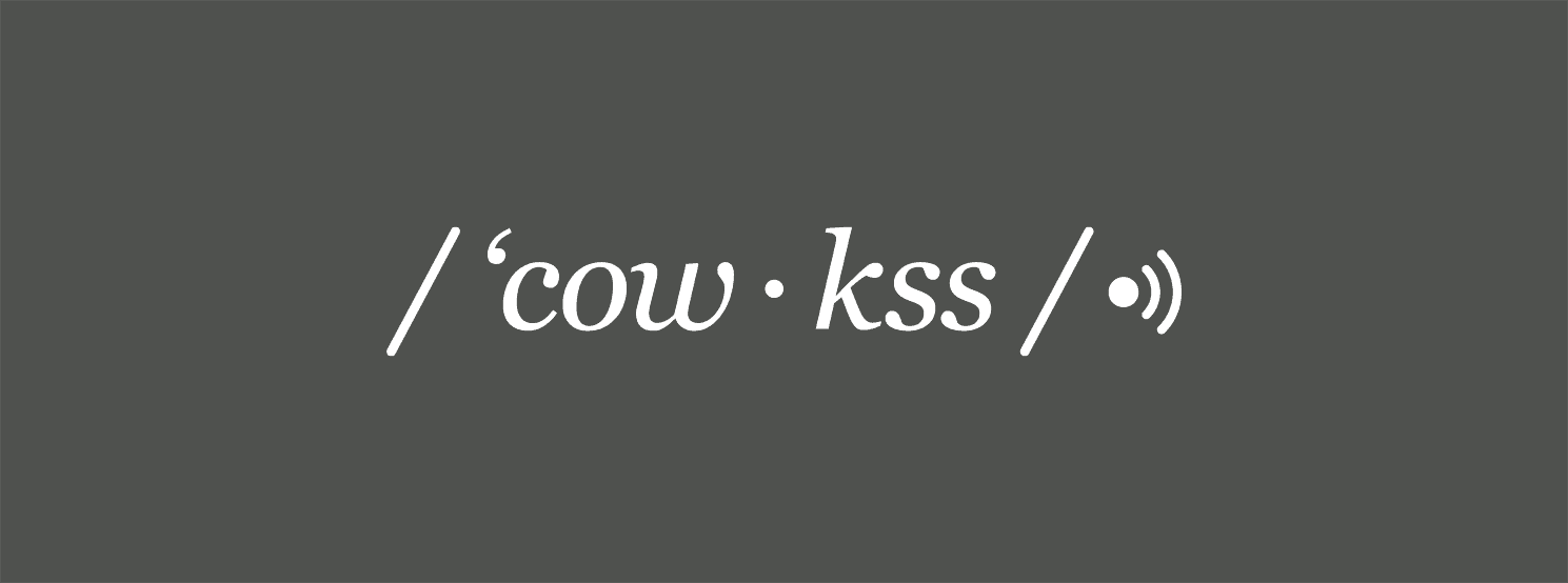
Hey there, my name is Nat. I am a brand and design consultant and owner of Studio Cowx. When I decided to start up the studio, the one thing that I was absolutely sure about was the name. It was never a question. It was always going to be my maiden name. The need to retain my identity and honour the family name was important to me. Little did I realise the significance of such a name. I looked in to my family history and discovered a few generations ago a few rebels in the clan broke off from the name Cowie and decided upon the hard-to-pronounce derivative of Cowx (pronounced Cow-kss to save any awkwardness).

Typographic traditions
The gem in the discovery was their trade. They were cattle farmers. It was meant to be. Branding in the traditional sense comes from branding cattle so as to easily identify your livestock. Following research in to cattle branding marques I fell in love with the typographic stories. Identities with purpose. Continual flowing flicks and wiggles, ticks and letter stacks to easily differentiate one herd from another.

Making the marque
Identities with purpose is a rule I apply to everything I do. It’s something that was drilled in to me during my time studying Graphic Design at the world class Duncan of Jordanstone College of Art and Design. Why are you doing what you’re doing, who are you doing it for, what do you want to say and how are you going to say it to maximise stand out in a field full of competitors.
I played with the letters, adding flourishes here and there, developing it till I hit a brick wall. I had taken it as far as I could and needed help. Reaching out and sharing my sketches with talented creative Artworker Ray Browne to see where he could take it was going to be the point where it was going somewhere or it was time to ditch it. If he couldn’t solve it then nobody could.


Welcome to our brand new brand!
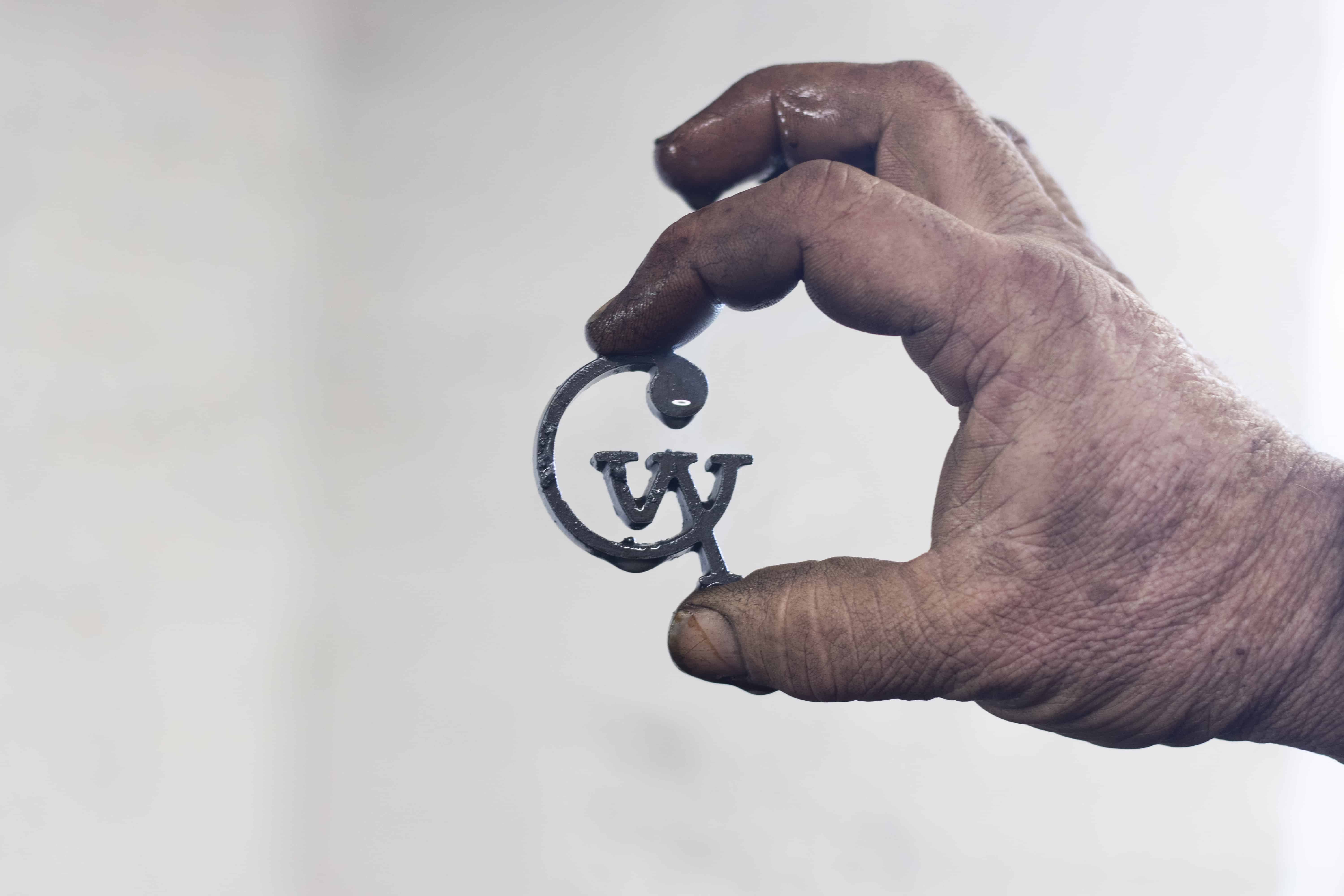
He nailed it. A continual simple, clean linking monogram of letterforms, connecting with one another in a unique jumbled unexpected way that somehow just works whether it be on the back of a hefer’s ass or on the front of a business card.

Understanding the process
I wanted to take it a step further and have my own Studio Cowx branding iron made in its traditional form to understand the process. Don’t worry, I’m not unethically wielding a Studio Cowx branded hot iron around the local fields any time soon just to make my mark. I find the whole procedure a wee bit cruel on the poor cows to be honest. But in an age of fast computer produced design and mass production, it has given me a greater understanding of how fragile, organic and hands on the traditional process of forging is.


Tried and tested
I discovered how unpredictable the traditional method of branding was. So in the end I compared laser engraving the machine way and it turned out to be so much easier and consistent and the end result was much more accurate. You can see the difference in the results above. Thank you so much to Dan and Vic over at Environmental Life for producing these really beautifully engraved cute little stainless steel drinks bottles for us to test on. If you would like one just get in touch and I can get one sent to you or you can have your own personalised one made yourself at Mintie Lunchboxes. They look great on your desk, hooked on to your adventure bag, handy for the kids at school and at the same time they help reduce single use plastic waste. I like to fill mine with wine when I’m off duty. An all round win win (or should I say wine wine!).


As part of the brand I chose two colours; Cow Pat Green and Milky White and had the business cards letter-pressed on to Colorplan. Each business card has it’s own individual levels of detail as an outcome from the printing process which is a nice little historical nod to branding.

Milking it
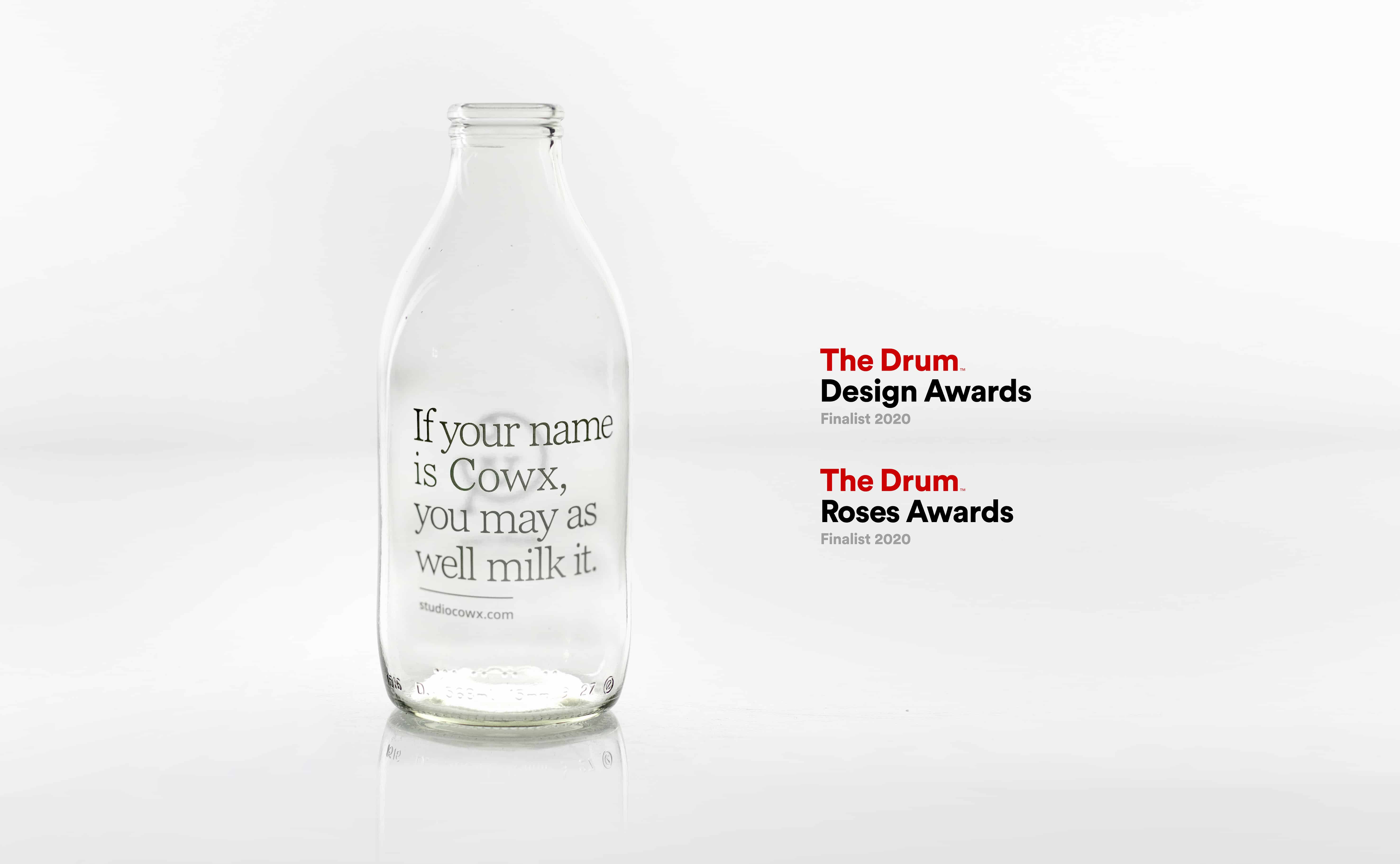
To promote the brand I hand delivered personalised messages in milk bottles to local businesses in the area. The mailer proved really popular and I was so chuffed to find out it had been nominated for a Drum Design Award and Drum Roses Award that year.

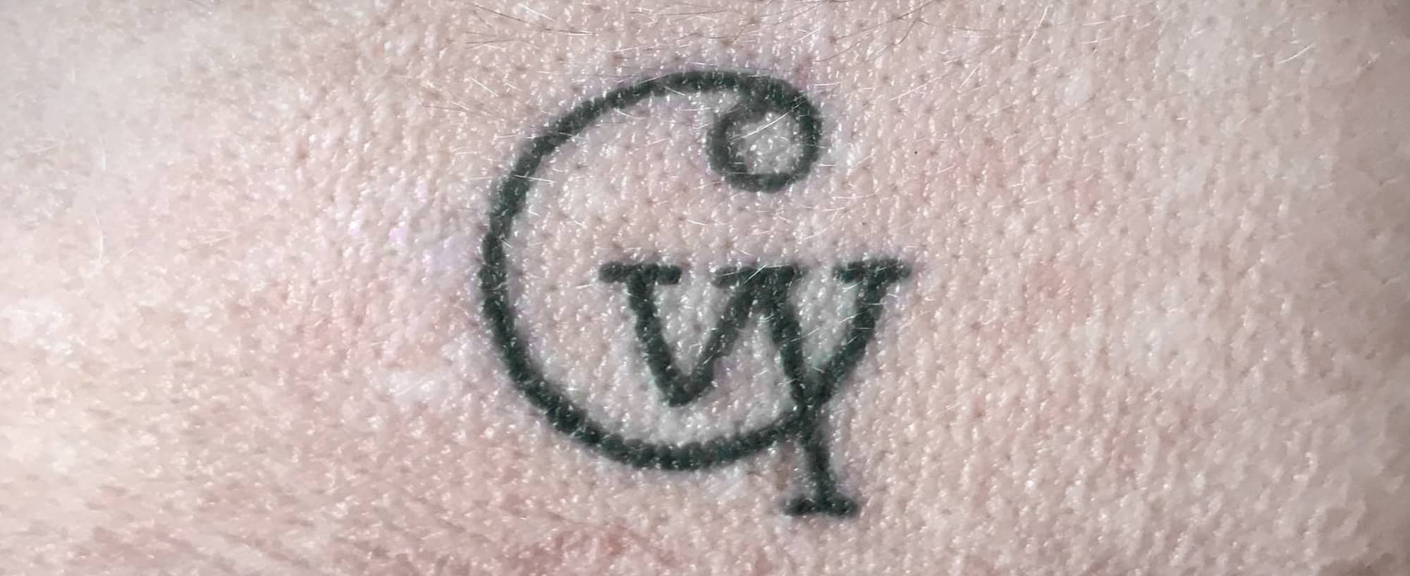
Since launching the new identity it seems to have stirred up quite a bit of excitement within the Cowx clan itself. Relations taking the Studio Cowx logo to their local tattoo parlour and physically branding themselves to mark a major milestone birthday and some others proudly claiming it as our very own modern family crest. In all my years in the job, seeing and hearing the family’s pride in the Studio Cowx logo has been the ultimate success story. A true brand experience.
My job here is done I’d say.

Author
Nat Cowx
Credits: ‘Auntie’ Linda Lickrish __Dan at Environmental Life __Encyclopaedia Britannica, Inc. __Joe Coleman, Copywriter __Ray Browne, Heavyweight Artwork __Richard and Ben, Blacksmiths, Phoenix Metalcraft __Jayne Shaw, Seaways Services __Tim Tyler, Selsey Press
